
By Darren Johnson
Campus News
Campus News began eight years ago, and one thing we noticed right away was that stock photography performs better than original photography.
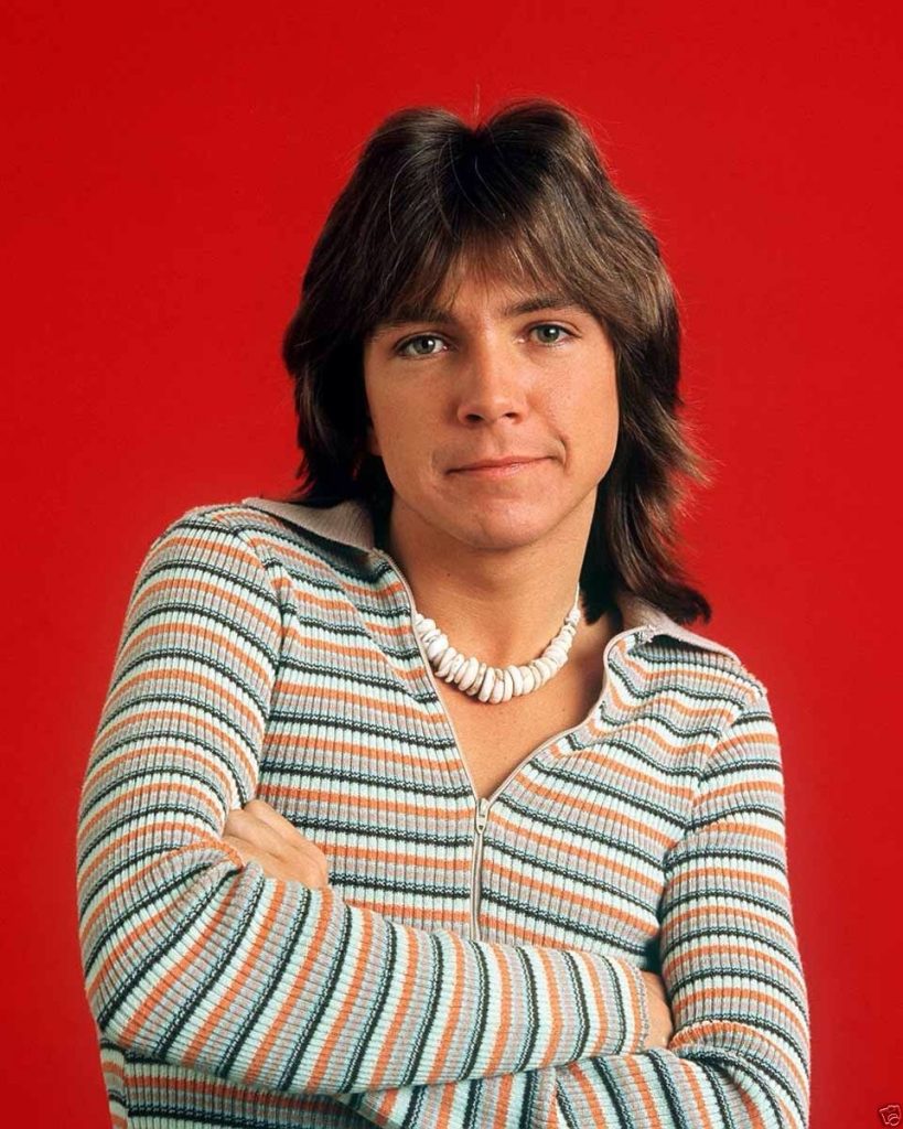
In case you don’t know, stock photography is rather all-purpose, professionally shot photography gotten through a service. An example is above.
This is counter-intuitive to everything I’d learned in my years as a community journalist, where we never used the stuff — except perhaps in advertorials in the back of the paper: Shill writing that us “real” journalists looked down upon (I would refuse to write advertorials, if asked). Stock photography — to my trained eye — looked inauthentic, soulless and without personality, like the art in motel rooms.

But it’s quite obvious that if we use a stock photo on the cover of the paper to accompany a rather all-purpose article, we get a much better pick-up rate. At first, this reality pained my journalistic soul (though not my wallet, as these photos only cost about $7 each), but, after a while, I learned to enjoy stock photography. I mean, these are real photographers, shooting real models. Who am I to devalue that work? To think my own photography would be more meaningful? Perhaps I was being elitist, a snob.
Then the web happened, big time. And I notice many very popular articles use stock photography. At the very least, from a layout perspective, a stock photo is better than no photo.
These may be the reasons why stock photography works better than original photography:
- While stock photography may be generic, and original photography specific, the former won’t lose you a customer. For example, our recent cover with a stock image of a woman dressed for success, which we linked to an article on interning, performed better than the issue before it, with an original photo of a campus food program. The original photo wasn’t bad, but it conveyed something specific — a person passing our rack either was interested in that specific topic, or not. The latter person would not pick up the paper, because a choice was presented. But the stock art was vague enough to elicit curiosity — thus, a higher pickup rate.
- Stock photography is perfectly composed, angled and Photoshopped. The colors are more vibrant and the juxtaposition of elements in the photo are just right. This serves as a better design element than original photography. Let’s put our egos aside — unless we are at a huge daily paper, we likely don’t have that same photographic talent on staff.
- Stock photography fits the page, as opposed to the page fitting the photography. For example, with stock photography, you can usually find exactly what you need — a vertical photo facing inward? No problem. However, with original photography, the photo is the photo. You may have to reflow text because of the photo, to the detriment of design.
Overall, stock photography is inclusive, while original photography is exclusive. For a modern print paper — considering the web scoops all exclusive stories — inclusivity may be the better tact.
Some tips: Don’t use stock photography that is “sexy” or too slick. Don’t use smiling models. Models should not be looking into the camera. Be sure to represent diversity. Don’t be corny. Avoid montages where graphics are placed around photos — those look too much like cheap ads.
But we editorial people need to get off of our high horses. The readers have spoken — they don’t mind stock photography. I’ve actually grown to respect this art.
Darren Johnson publishes Campus News.

Facebook Comments